GDP per Capita v.s. Population
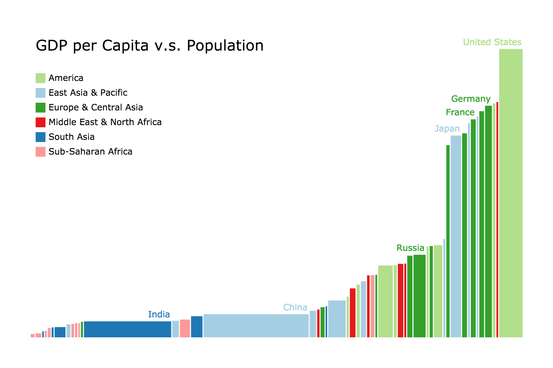
This chart displays the relationship between the GDP per capita and the population of the 50 most populous countries. Each country is shown as a rectangle, where the width represents its population and its height represents its GDP per capida, so that the area represents the total GDP.
Dataset
Retrieved from Gapminder