Reusing charts
You can reuse a chart design for differnt datasets either (1) by importing a Charticulator template to the current dataset or (2) by swapping in a new dataset into an existing Charticualtor design session.
Import a Charticulator Template
Clicking the ![]() icon in the toolbar will display a file open dialog so that you can select a template file. If the current dataset has all the data columns used (and thus are required) in the template, having the same column name and data type for every column, Charticulator immediately redraws the chart applying the selected template.
icon in the toolbar will display a file open dialog so that you can select a template file. If the current dataset has all the data columns used (and thus are required) in the template, having the same column name and data type for every column, Charticulator immediately redraws the chart applying the selected template.
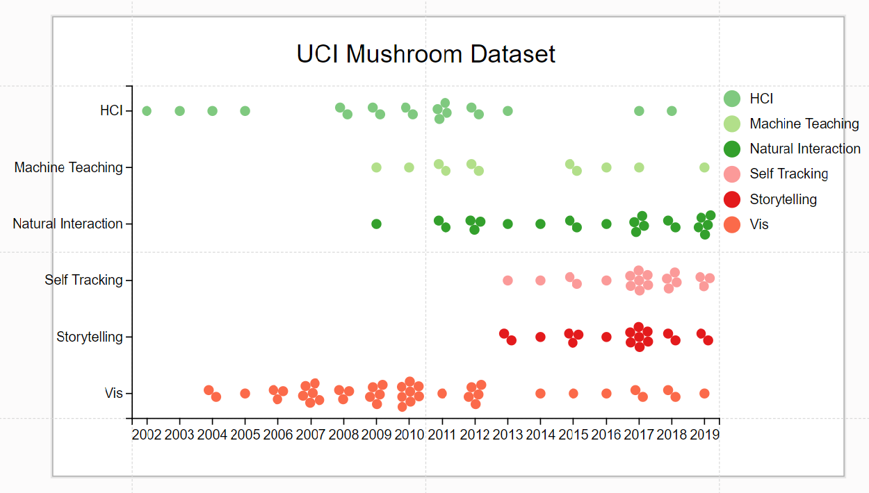
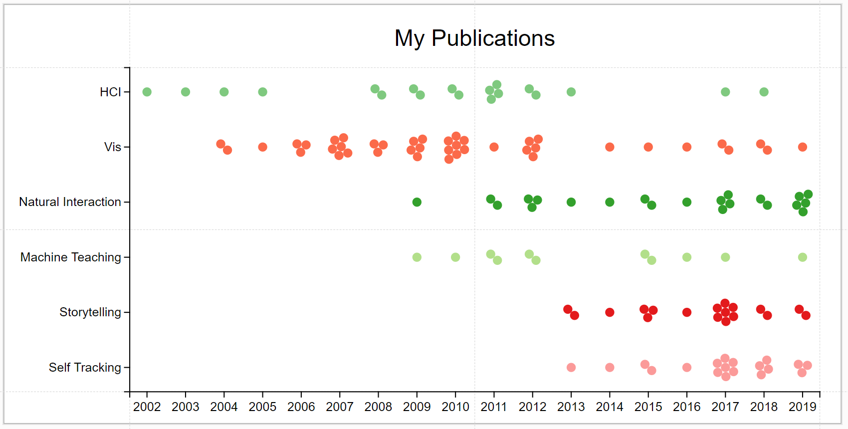
Otherwise, Charticulator opens the Map your data window, asking you to create mappings between the data columns in the current dataset and those used in the template. Once you create all the required mappings, the "Save mapping" button is enabled. For example, a dot plot template created with a mushroom dataset requires three data columns: one for the x-axis (Odor), andother for the y-axis (Surface), and the third for the color coding (IsEdible). For a publication dataset that includes the research area of the paper and the year the paper was published, you can map the x-axis to Year and both y-axis and color to ResearchArea.
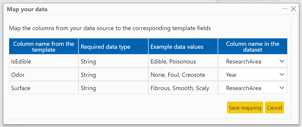
Once you click on the "Save mapping" button, you see the chart generated using the template.
You can edit the chart to achieve your intended chart design, best matching your dataset. For example, you can change a hard-coded text (e.g., title), the axis ordering, and the legend location & orientation.
Swap in New Dataset
Clicking the ![]() icon in the Dataset Panel will display a file open dialog so that you can select a new dataset file. If the new dataset has exactly the same structure --- the same number of columns as well as same column name and data type for every column --- Charticulator immediately redraws the chart once the dataset file is selected.
icon in the Dataset Panel will display a file open dialog so that you can select a new dataset file. If the new dataset has exactly the same structure --- the same number of columns as well as same column name and data type for every column --- Charticulator immediately redraws the chart once the dataset file is selected.
Otherwise, Charticulator opens the Map your data window to allow you to create mappings between the data columns used in the current design and those in the new dataset.
Chart Output
You can reuse your chart design in six ways: (1) save it in the 'My Charts' list within Charticulator, (2) download it as a chart file, (3) export it as an image file, (4) export it as an HTML file, (5) export it as a Charticulator template, and (6) export it as Power BI Custom visual.
Save to My Charts
You can save chart designs to the 'My Charts' list. Please note that your data and your charts remains local in your browser unless you download them as a chart file.
Download as Chart
Once your chart is saved to the 'My Charts' list, you can open the saved chart or download it as a chart file from the list. To open a saved chart, click the ![]() icon at the bottom right corner of the item.
icon at the bottom right corner of the item.
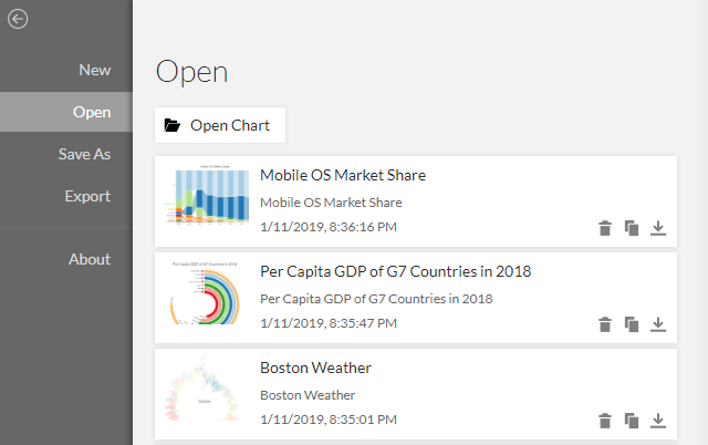
You can open the downloaded chart from a different machine. Click the Open Chart button in the Open panel to select the chart file. Please note that a downloaded chart file contains both data and chart design.
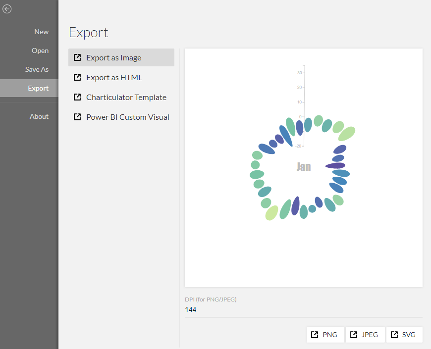
Export as Image
You can export chart designs as images in PNG, JPEG, and SVG format. For the PNG and JPEG formats, you can specify the desired DPI (Dots per inch).
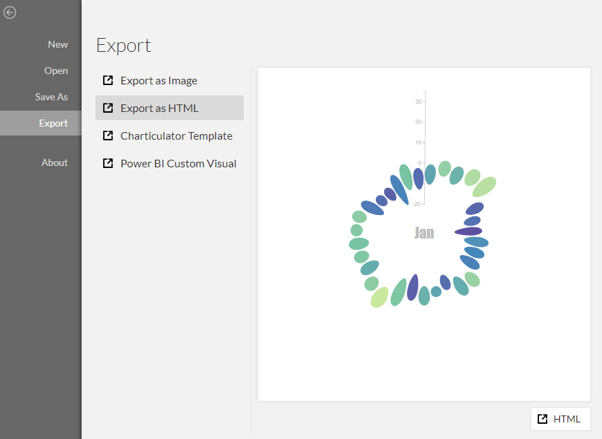
Export as HTML
You can export chart designs as an HTML file.
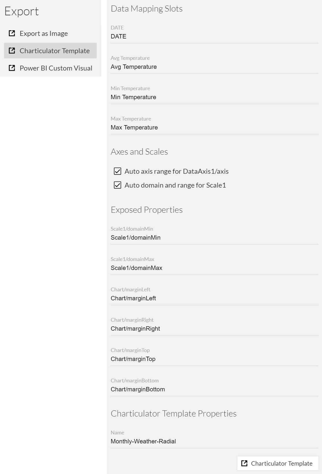
Charticulator Template
You can export chart designs as a Charticulator Template, which can be (1) imported to apply the chart design or (2) loaded as a chart component to create a nested chart. Once you click the "Charticulator Template" button at the bottom, a template file is created in JSON format.
Power BI Custom Visual
You can export chart designs as a Power BI Custom Visual (.pbiviz), which can be imported into Power BI. Check out how you can use the chart design in Power BI. Note that not all chart designs can be exported as a valid custom visual that can be imported into Power BI.
Nested Chart
Charticulaor allows you to create a small multiple, a series of similar graphs or charts using the same scale and axes, by using a nested chart (or a chart component).
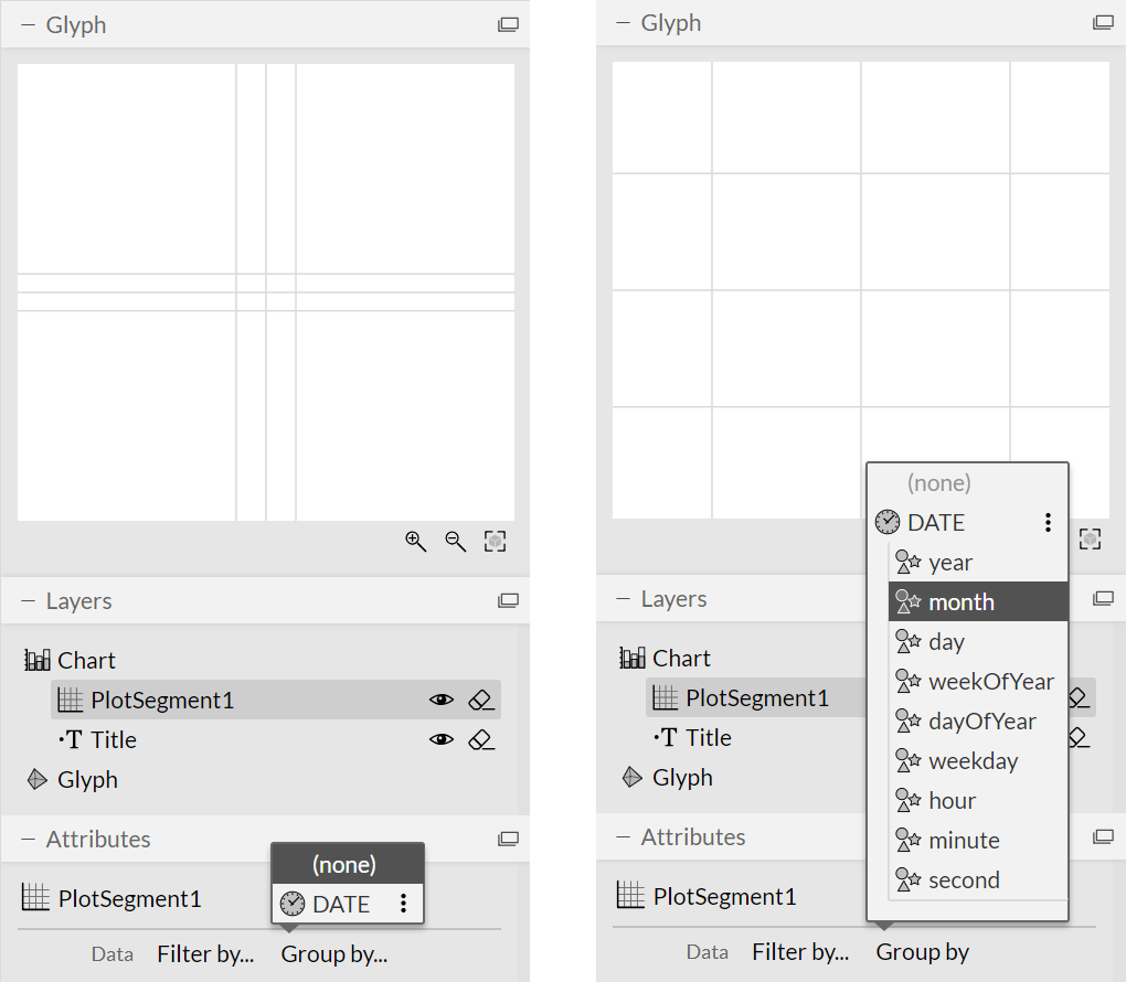
You first need to select the "Group by" field of the Plot Semgment before adding the Nested Chart compenent to the Glyph Editor.
For example, if you want to create a small multiples with 12 months of Boston Weather, choose the "month" from the DATE data column. Once the group by is applied, the guides layout within the Glyph Editor is updated accordingly.
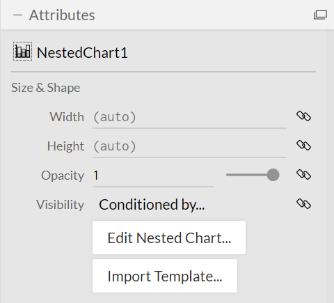
To add a nested chart component to a glyph, you can drag it from the Toolbar and drop it into the Glyph Editor.
Once a nested chart is added, you can edit it directly or import a Charticulator Template.
Because a small multiple typically needs larger space than a single chart, it is a good idea to increase the chart size before editing the nested chart.
When you click on the "Edit Nested Chart..." button, another Chaticulator will open in a new tab. Because the nested chart usually does not need as large margin as a regular chart, it is a good idea to decrease the margins of the chart before you edit the glyph. (The margin between the nested charts can be adjusted in the main Charticulator.)
Unlike the main Charticulator page, the header will have the "Save Nested Chart" button. Whenever you click this button, the main chart will be automatically updated.
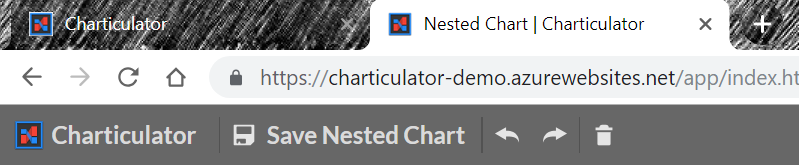
You can swtich back and forth between the main Charticualtor and the one for the nested chart