Creating Charts
In contrast to existing chart creation tools, Charticulator allows you to interactively specify a chart's layout. It automatically places glyphs based on your layout specification. Like other chart creation tools, Charticulator allows you to interactively style individual chart elements such as size, color, font, etc. In this tutorial, we describe the set of interactions used to create a chart in Charticulator.
Interaction
Adding a Mark (to a Glyph)
Charticulator supports five types of marks: a Shape, a Symbol, a Line, a Text, and an Image. To add a mark to a glyph, you can drag the desired mark from the Toolbar and drop it into the Glyph Editor. Charticulator places the new mark at its default position: the center of the glyph. Charticulator also adds a corresponding entry to the Layers Panel.
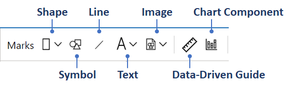
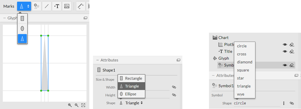
Charticulator supports three types of shapes: rectangle, oval, and triangle, as well as seven types of symbols: a circle, a cross, a diamond, a square, a star, a triangle, and a wye. You can change the shape type and symbol type from the Attributes Panel.
To place a mark at a specific location, you can click the mark to activate it and click or drag within the Glyph Editor, depending on the mark type.
Binding Data
You can drag a data column from the Dataset Panel and drop it into dropzones in the Glyph Editor, the Chart Canvas, or the Attributes Panel. The compatible dropzones will appear (highlighed in blue) once you start dragging a data column, and then when you move your cursor over a drop target it will be highlighted in orange.
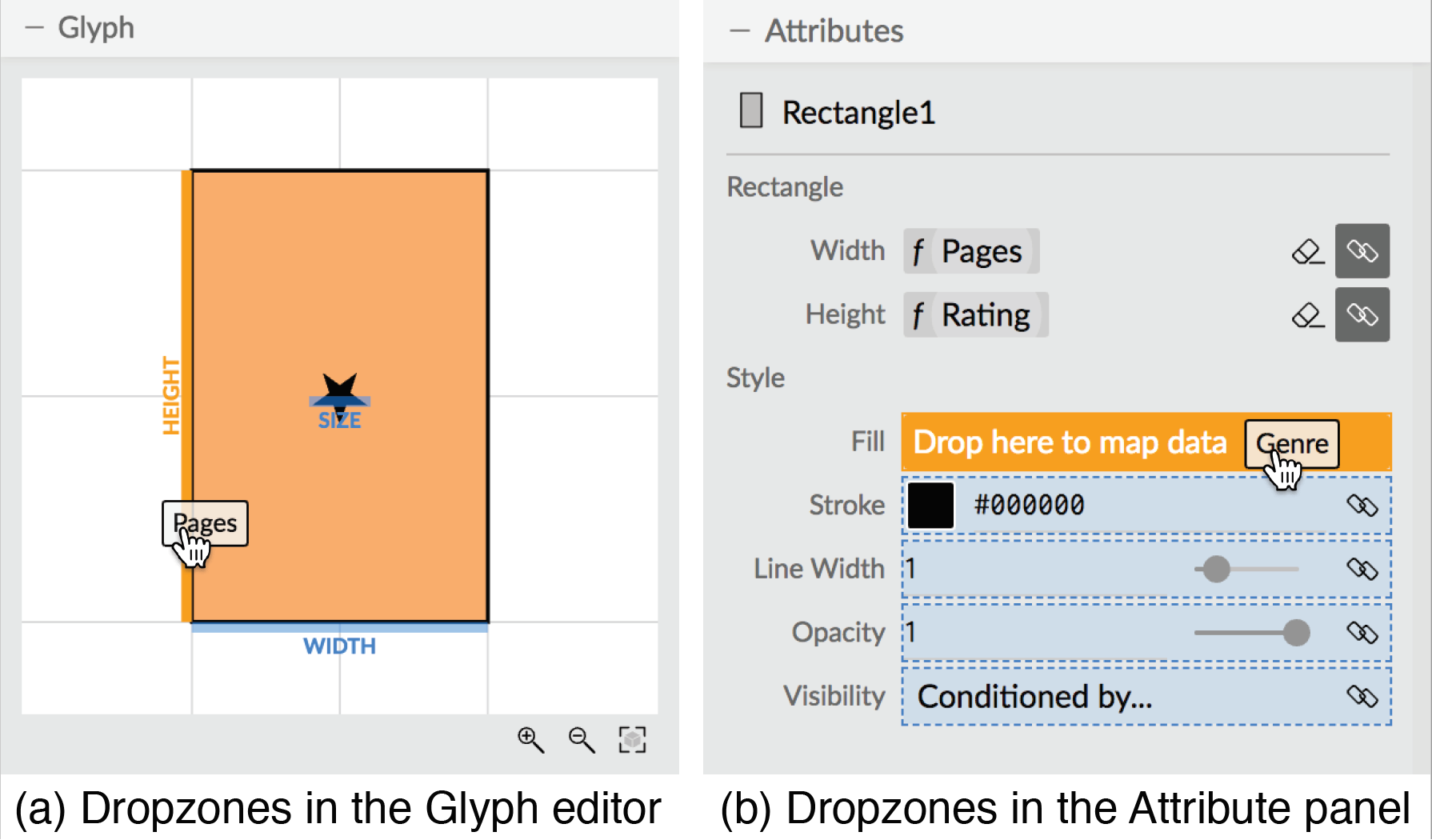
You can also select the data column from data binding popup panels in the Attributes Panel.
Specifying Constraints
You can specify the layout relationship between two objects using anchors and/or handles. For example, you can snap elements to the guides, such as the default guides in the Glyph Editor and Chart Canvas.
For instance, you can ensure the same gap between a text mark and a rectangle in the Glyph Editor by dragging the anchor of the text to the top of the rectangle. Similarly, you can drag a gap handle to adjust the gaps between glyphs in the Chart Canvas.
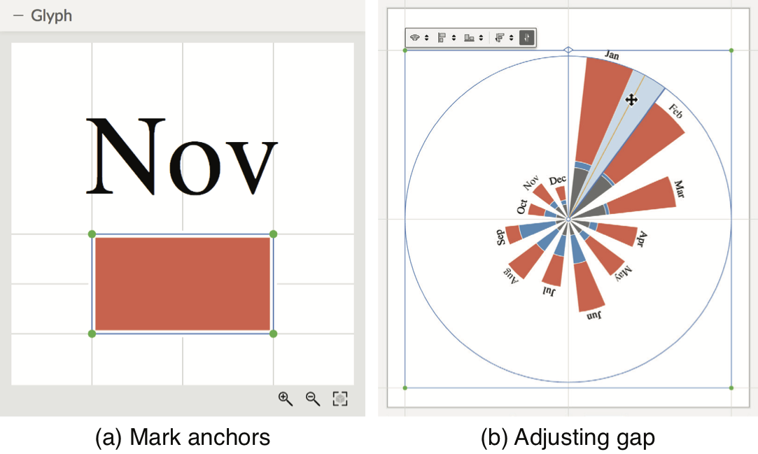
To reuse a chart design in Power BI, it is crucial to anchor visual elements to appropriate guides (for both directions). For example, each of the four corners for the default plot segment is anchored to the intersection of two default guides. When you add additional plot segment or adjust the existing one, do not forget to anchor their four corners to the intersection of two guides.
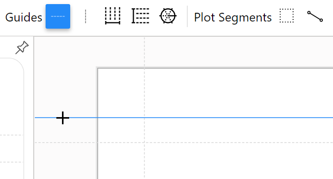
Creating a Guide
Chariculator has four default guides (Top, Bottom, Left, and Right), which are placed relative to the chart canvas using the Chart's Margin attribute values. Middle and Center guides are in the middle of Top & Bottom and Left & Right, respectively.
You can create your own guides to facilitate the alignment of elements. As a guide needs to be added at a specific location, to create a guide, you first need to click the desired guide (horizontal or vertical) in the Toolbar to activate it; subsequently clicking on the Glyph Editor or Chart Canvas will add the new guide. Your own guide can be placed relative to one of the four default guides.
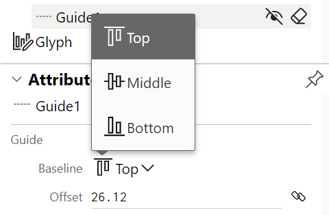
You can change the baseline for each guide and adjust its offset from the baseline.
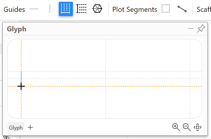
On the other hand, the guide coordinator needs to be placed along a line. Therefore, you need to click the guide coordinator from the Toolbar to activate it and then drag within the Glyph Editor or Chart Canvas.
Creating Links
To create a link between glyphs, you must specify the shape (i.e., line or band) and connection method from the corresponding panel in the Toolbar.
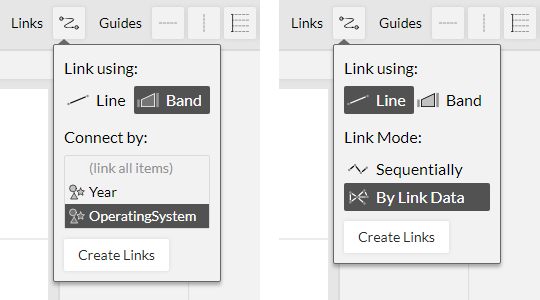
You can adjust the anchor positions of links directly from the Chart Canvas.
Scales and Legends
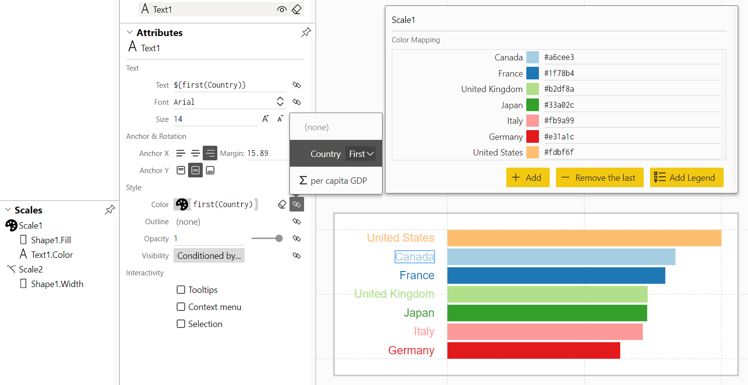
For attributes that are bound to data, Charticulator uses a scale to determine how the data is mapped to visual properties. Scales are listed in the Scales Panel and have their own attributes. You can edit their attributes by toggling a scale view from the Attributes Panel. For example, you can change the color mapping for categorical data
and change the range mapping for numeraical data
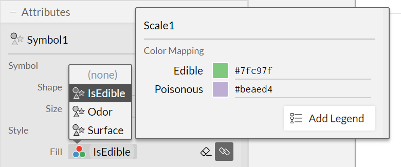
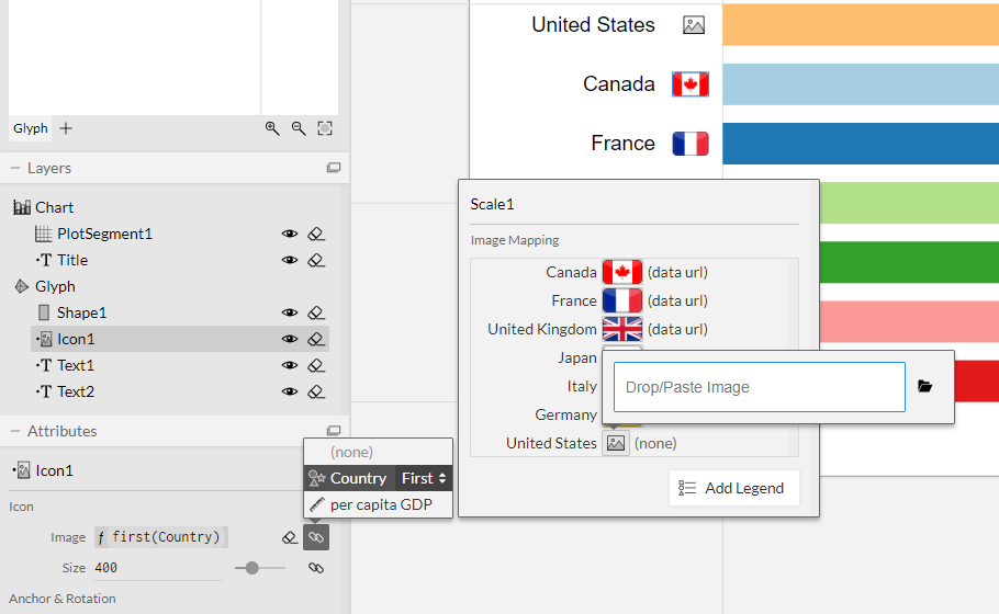
For the image field of the icon mark, you can assign an image for each unique data value.
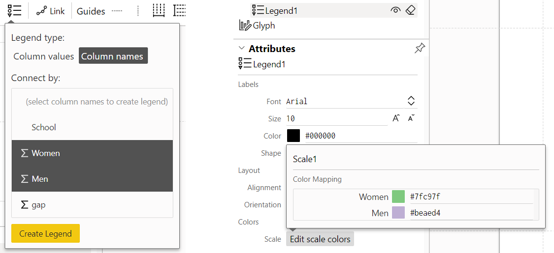
Adding a legend
Legends visualize the scales used in a chart. Charticulator currently uses a predefined legend for each scale type: color legend for categorical data; color legend for numerical data; and range legend for numerical data. You can add a lenged to the chart by clicking on the "Add Legend" button from a scale view.
As for categorical data, you can create a scale and a corresponding legend in two ways. As described above, when you bind a data column to a visual property, Charticulator automatically creates a scale using data values from the column and allows you to add its legend to the chart. In addition, you can a scale and a corresponding legend using data column names: in this case, the legend is automatically added to the canvas.
You can edit the color mapping by toggling a scale view from the Attributes Panel.
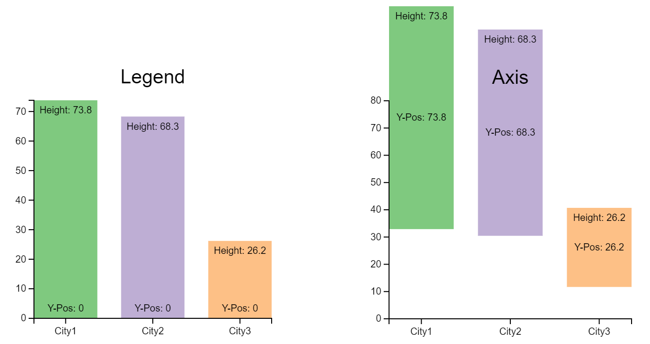
(Range) Legend vs. Axis for numerical data
When you add a range legend for numerical data, it is positioned along the axis by default, thus looking same as a numerical axis. However, as illustrated below, the legend is for the height (or width) of a glyph while the numerical axis is for the posion of of a glyph.
Reusing a scale
Charticulator enables you to reuse an exising scale. You can drag a scale from the Scales Panel and drop it into the target zones in the Attributes Panel. In addition, Charticulator tries to resue an exising scale automatically, when appropriate. For example, when you bind a Country column to the color of text (after biniding it to the color of the corresponding bar), Charticulator reuses the scale created for the bar's fill color.
Data-Driven Visibility
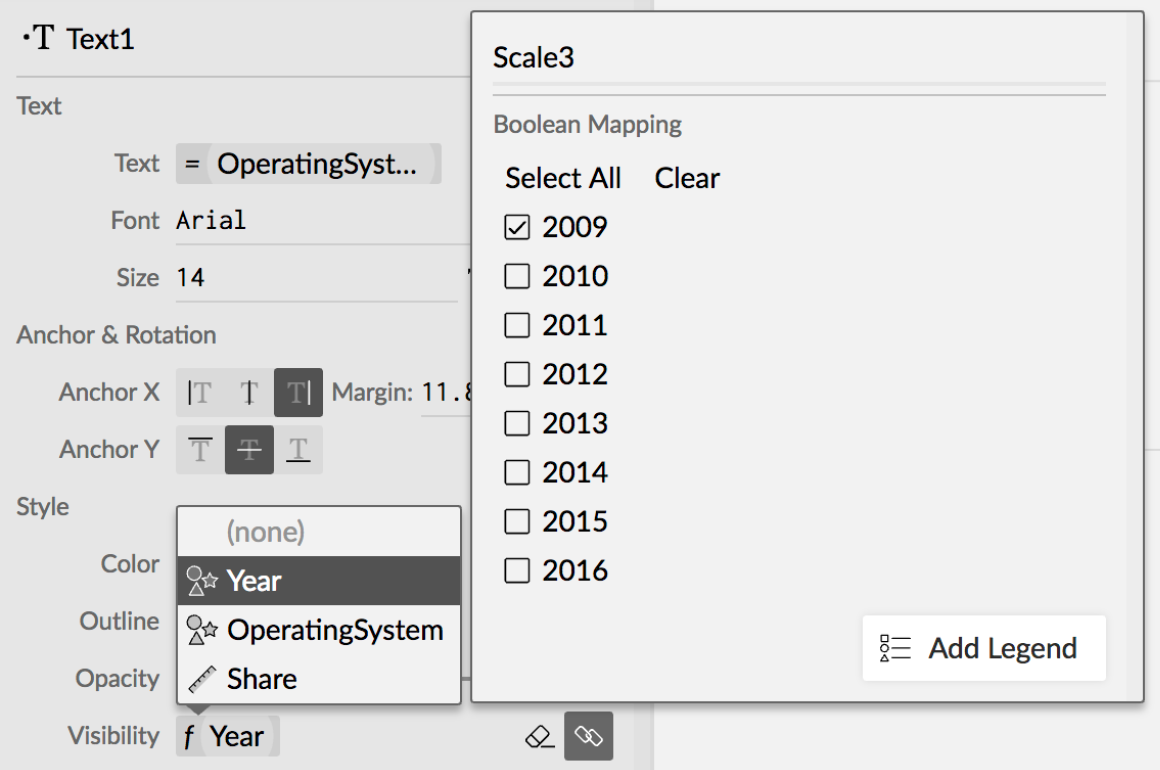
Charticulator also supports data-driven visibility, where the visibility of marks is determined by data values. Clicking on the "Conditioned by" button in the Visibility attribute invokes a popup panel, where you can set a filter. For categorical variables, you can set a filter via a set of checkboxes.
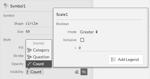
For numberical variables, you can specify a simple boolean query (e.g., Count > 0).
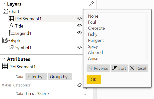
Sorting an Axis
As Charticulator by default handles the data in the order they appear in the table, the default order of the axes labels is determined by how the data is ordered in the table. Therefore, Charticualtor allows you to chanage the order of the X and Y axes labels. You can either automatically order them by data values or manually reorder them with a drag-and-drop interaction. In addition, you can reverse the current order of the labels, or reset to the default order.
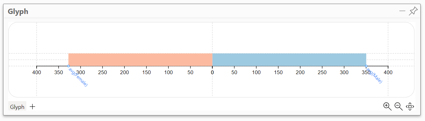
Data-Driven Guides
A provides data-driven anchor points from data columns sharing the same numerical unit (e.g., min and max temperature values).
It can be displayed as an axis, though to avoid duplicated axes, Charticulator shows only the first instance. Glyph elements can be snapped to these anchor points by adding layout constraints (e.g., placing the circle mark at the anchor point of the “Avg. Temperature” data column).
A glyph can have multiple data-driven guides. For example, a diverging bar chart has the mark for one data column pointing right or up, and the mark for another data column pointing in the opposite direction (i.e., left or down, respectively). You can create a diverging bar chart by adding two data-driven guides, facing each other
To learn more about data-driven guides, please refer to the work of Kim et al. (2016).
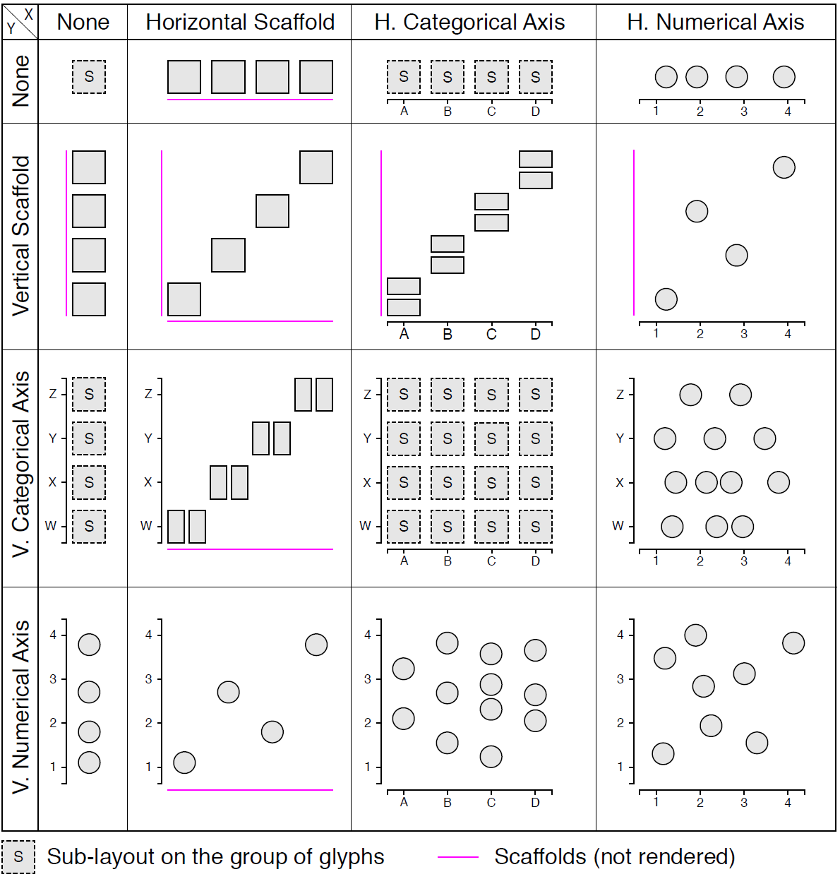
Layout Composition
By default, a chart begins with a rectangular plot segment and a Cartesian coordinate system. A plot segment has two independent layout directions, each of which can be assigned as a scaffold, a categorical axis, or a numerical axis.
- A scaffold stacks glyphs sequentially within the plot segment
- A categorical axis groups glyphs according to a categorical attribute, grouping them evenly along the axis
- A numerical axis positions glyphs according to their numerical values
The diagram below shows the possible layouts produced from combining scaffolds and axes.
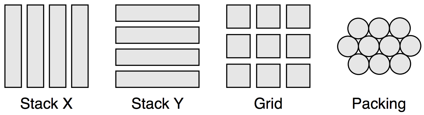
Sub-layouts
For categorical axes, Charticulator employs sub-layouts to determine a within-group layout. Charticulator currently supports four types of sub-layouts: horizontal stacking, vertical stacking, grid, and circle-packing.
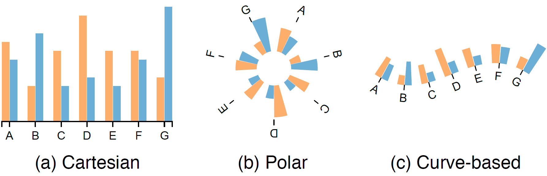
Coordinate Systems
Charticulator suppors three coordinate systems: Cartesian, Polar, and Custom curve. Charticulator morphs mark shapes in the two non-Cartesian systems, and its morphing maintains a precise data binding because the morphing is performed in vector graphics. For example, a rectangle becomes a wedge shape in a polor coordinate system and a custom curve coordinate system.
Text Formatting
Charticulator provides simple formatting for the text attribute. When the column name does not contain spaces or special characters, you can refer to a data column using the column name (e.g., Share, Temperature); otherwise, you need to enclose the column name with the grave symbol ` . Note that the expression is case sensitive.
avg(`Import Value`)
avg(`Avg. Temperature`)
Charticulator allows you to format the value of an expression with a format specifier, which follows d3's syntax. For example, when you bind a numerical variable (called Mean) to the text attribute of a text mark, the default text string is
`${avg(Mean)}{.1f}``
where {.1f} indicates one number is shown past the decimal point.
When Group by is applied, the data rows come as a list and thus it is necessary to use an aggregation function even if there is only one data row in each group. Charticulator, by default, uses an avg aggregation function in all cases.
Charticulator allows you to use simple arithmetic the expression. For example, if you want to convert the Temperature value from Celsius to Fahrenheit, you can change the text string to ${avg(Temperature) * 1.8 + 32}.
You can combine multiple columns to produce a single text string. Keep in mind that data rows come as a list, so it is necessary to use an aggregation function even if there is only one row. To compute the sum of the two columns, you can use the
${ avg(`Import Value` + `Export Value`)}
text string.
You can also combine data values with a regular string. For example, if you want to add a percentage sign % after the Share value, you can change the text string to ${avg(Share)}{.1f}%.
The dollar symbol $ is reserved to specify the expression. Therefore, if you want to include a dollar sign to the string, you need to prepend the backslash symbol \. For example, to prepend a dollar sign before the Price value with two numbers after the decimal point, the text string should be $${avg(Price)}{.2f}.
Charticulator currently support two constants --- E (=2.718281828…) and PI (=3.1415926…) --- as well as common math functions including floor, ceil, exp, log, sin, cos, tan, sqrt, and pow. In addition, it supports common aggregation functions such as min, max, sum, avg, stdev, variance, median, and count. It also allows you to retrive the first and last value with the first and last fuction, respectively.
Formatting Axis Tick Labels
For the Numerical Axis, you can format the axis tick labels by setting the tick format field using a similar format specifier. Because you are using the data bounded to the axis, you should not specify a data column name (with a dollar symbol). For example, to show a percentage for a numerical data, the tick format string should be {.0%}. If you want to prepend a dollar sign to the tick values with a single number after the decimal point, the tick format string should be ${.1f}.