Step by step guide
Import visuals
Import Power BI Visual Editor and HTML/SVG/Handlebars Visual files into Power BI.
Read more about importing visuals in official documentation.
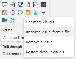
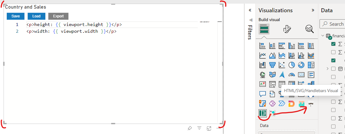
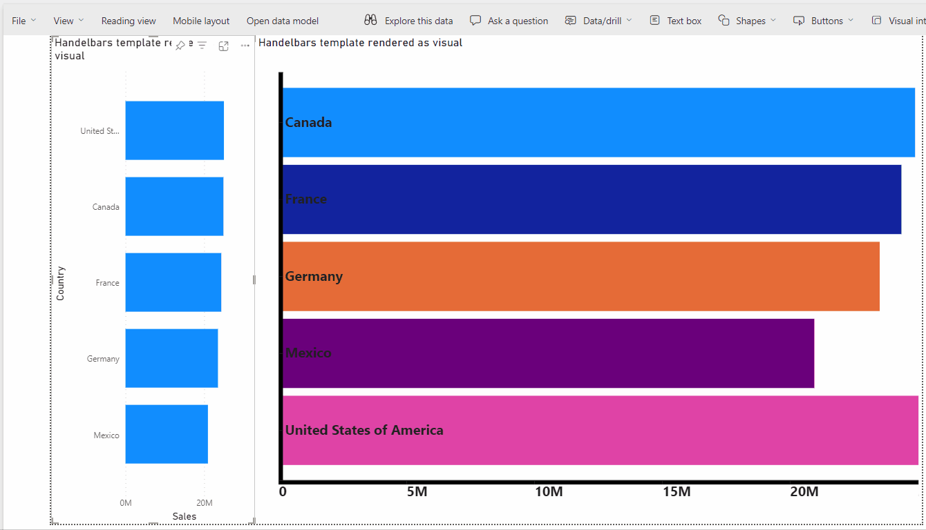
To use visual, click the visual icon in the visualization panel, or open the report context menu if you are using the object interaction preview feature, and select "Add Visual".
Switch the Editor Visual settings to customize the HTML/SVG/Handlebars Visual settings:
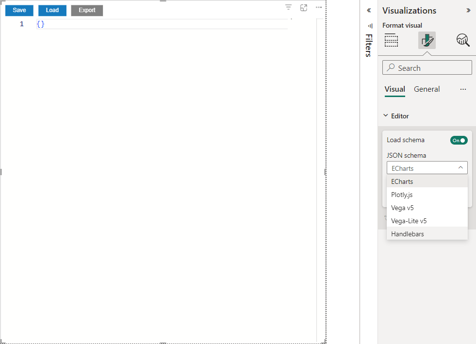
Select "Handlebars" for "JSON Schema" and "HTML/SVG/Handlebars" for "Target visual for editing".
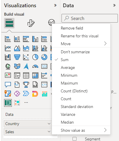
Assign data to the visual. You need one categorical column and one measure.
The editor is ready to use.
Creating variables and using context
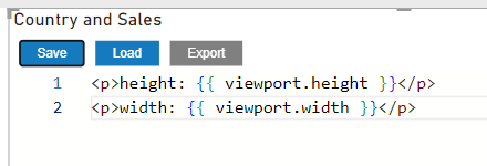
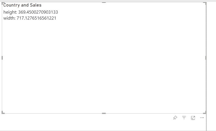
The visual defines table and viewport objects in the context of Handlebars.
To output the values of a context object, use an expression with HTML:
<p>height: {{ viewport.height }}</p>
<p>width: {{ viewport.width }}</p>
Then click save button:
Ensure "Visual Editor" is selected and click on HTML/SVG/Handlebars visual icon to switch visual:
HTML/SVG/Handlebars visual should display height and width values:

Template rendering responds to visual resizing:
Add some margins for each side of chart. Define the constant for that:
{{ var 'margin' 30 }}
Then define rest of constants too, for SVG element size, chart size uin SVG e.t.c.
<!-- SVG element width as svgWidth = viewport.width - margin -->
{{ var 'svgWidth' (sub viewport.width (val 'margin')) }}
<!-- SVG element height as svgHeight = viewport.height - margin -->
{{ var 'svgHeight' (sub viewport.height val 'margin') }}
<!-- Chart area group height as chartHeight = viewport.height - (margin * 3) -->
{{ var 'chartHeight' (sub viewport.height (multiply (val 'margin') 3) }}
<!-- Height of each bar as rectHeight = chartHeight / table.rows.length -->
{{ var 'rectHeight' (divide (val 'chartHeight') table.rows.length) }}
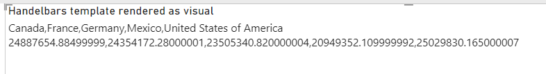
Use a table object from context to bind data to HTML output. Create two variables with array for each axis:
<!-- Create array of sales values -->
{{ var 'sales' (map ' Sales' table.rows) }}
<!-- Create array of country names -->
{{ var 'countries' (map 'Country' table.rows) }}
Check the output to make sure the arrays are defined correctly:
<p>{{ val 'countries' }}</p>
<p>{{ val 'sales' }}</p>
should give output:
Scales and axes
Create scales and axes for positioning rectangles on SVG canvas.
Scales
Use the following syntax to define scales:
{{ scaleLinear 'Name of scale' [min_input, max_input] [0 svgWidth] }}
{{ scaleBand 'Name of scale' [categorical_values] [0, chartHeight]}}
Example for a measuring scale:
{{ scaleLinear 'Scale X' (array ( min (val 'sales')) ( max (val 'sales'))) (array 0 (val 'svgWidth')) }}
where
- 'Scale X' is name.
min (val 'sales')returns minimum value ofsalesarray defied above. 0 also can be used for displaying bar proportions correctly.max (val 'sales')returns maximum value ofsalesarray defied above.(array ( min (val 'sales')) ( max (val 'sales')))creates array with two elements, minimum and maximum values of Sales column.(array 0 (val 'svgWidth'))creates array of two elements too, with 0 and 'svgWidth' variable value.
Example for categorical scale:
{{ scaleBand 'Scale Y' (val 'countries') (array 0 (val 'chartHeight')) }}
where
(val 'countries')is array of country names.(array 0 (val 'chartHeight')is array of 0 and 'chartHeight' variable value.
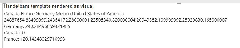
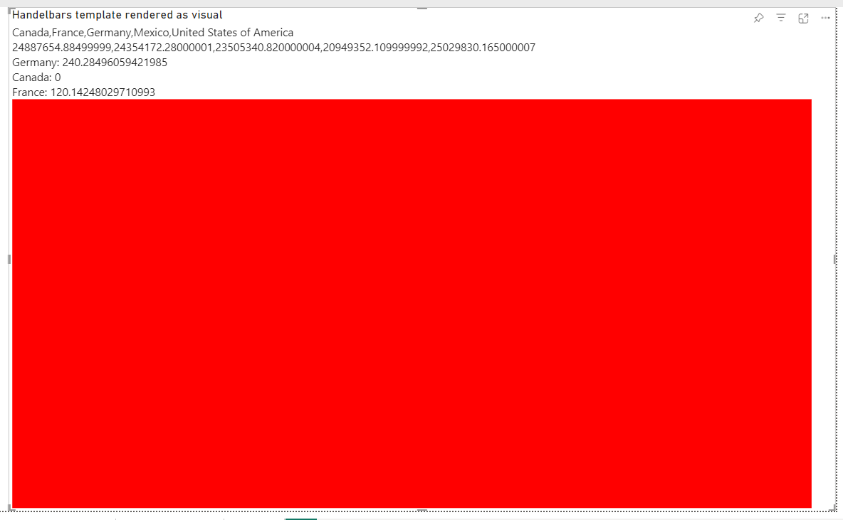
You can test scales output by using useScale function:
<p>Germany: {{ useScale 'Scale Y' 'Germany' }}</p>
<p>Canada: {{ useScale 'Scale Y' 'Canada' }}</p>
<p>France: {{ useScale 'Scale Y' 'France' }}</p>
The scale should give the appropriate position value for each country name:
Axes
Define two axes using auxiliary functions: axisBottom and axisRight that uses correspond D3.js functions:
{{ axisBottom 'name' 'defined scale' }}
{{ axisRight 'name' 'defined scale' }}
Example:
{{ axisBottom 'axisMeasure' 'Scale X' }}
{{ axisRight 'axisCategory' 'Scale Y' }}
'axisMeasure' uses 'Scale X' scale. 'axisCategory' uses 'Scale Y' scale.
Configure 'Scale Y' scale, set inner and outer paddings:
{{ setupScale 'Scale Y' 'paddingOuter' 0.2 }}
{{ setupScale 'Scale Y' 'paddingInner' 0.1 }}
Configure 'axisMeasure', set ticks count and tick format for formatting tick values:
{{ setupAxis 'axisMeasure' 'tickFormat' '~s' }}
{{ setupAxis 'axisMeasure' 'ticks' 5 }}
SVG template
Use SVG element to render chart.
SVG element
Use svg tag in template to define SVG:
<svg width="100" height="100">

</svg>
It defines an SVG element with a size of 100x100. Use the defined variables 'svgWidth' and 'svgHeight' to respond to changes in visual size:
<svg width="{{ val 'svgWidth' }}" height="{{ val 'svgHeight' }}">
    <!-- Add red rectangle with the same sizes to see output -->
    <rect  width="{{ val 'svgWidth' }}" height="{{ val 'svgHeight' }}" fill="red"/>
</svg>
After switching to HTML/SVG/Handlebars you should see red rectangle:
You can remove p elements used for testing.
Bars
Add g (grouping) element to group chart elements and set position to all children.
<svg width="{{ val 'svgWidth' }}" height="{{ val 'svgHeight' }}">
    <g transform="translate({{ val 'margin' }}, {{ val 'margin' }})">
        <rect  width="{{ val 'svgWidth' }}" height="{{ val 'svgHeight' }}" fill="red"/>
    </g>
</svg>
Use transform attribute to shift group of elements to defined position. Use 'margin' variable to add margins left and top sides.

Create group element and rectangles for each category (Country):
<svg width="{{ val 'svgWidth'}}" height="{{ val 'svgHeight' }}">
    <g transform="translate({{ val 'margin' }}, {{ val 'margin' }})">
        <g>
            {{#each table.rows}}
            ...
            {{/each}}
        </g>
    </g>
</svg>
Use #each build in block helper, to iterate over table rows.
Create rectangle element for each category (Country) value:
<svg width="{{ val 'svgWidth' }}" height="{{ val 'svgHeight' }}">
    <g transform="translate({{ val 'margin' }}, {{ val 'margin' }})">
        <g>
            {{#each table.rows}}
            <rect
                x="0"
                y="{{{ useScale 'Scale Y' this.Country }}}"
                width="{{{ useScale 'Scale X' this.[ Sales] }}}"
                height="{{{ getScale 'Scale Y' 'bandwidth' }}}"
                fill="{{{ useColor this.Country }}}">
            </rect>
            {{/each}}
        </g>
    </g>
</svg>
where
- 'x' is 0, align rectangle to the left side.
- 'y' - vertical position depends on 'Scale X' scale value: '{{{ useScale 'Scale Y' this.Country }}}'. Use {{{ }}} to avoid HTML escaping.
' this.' - reference to the current context of
eachblock. - 'width' depends sales values, so use 'Scale X' scale to map scale values to SVG coordinates.
- 'height' - bind 'bandwidth' value from scale 'Scale Y' that depends on inner and outer paddings.
- 'fill' - use
useColorhelper to bind color from Power BI palette. It gives color for each given category (Country name) value.
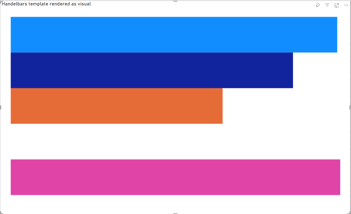
Output with min (val 'sales')) for min value:
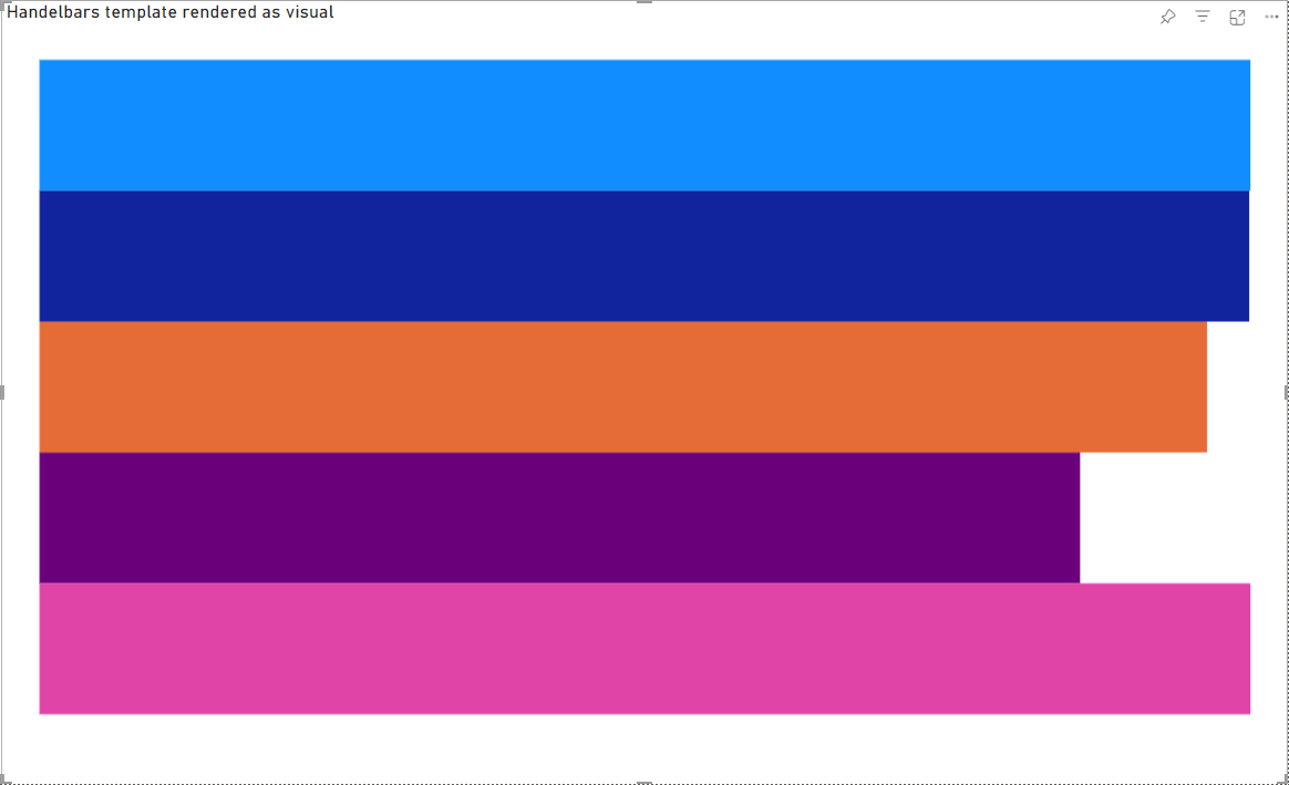
Output with 0 for min value:
Axes
The last step is rendering axes:
    <g>
        {{{ useAxis 'axisMeasure' 'Scale X' }}}
    </g>
    <g>
        {{{ useAxis 'axisCategory' 'Scale Y' }}}
    </g>
Move measure axis to bottom side of chart (shift to chartHeight):
    <g transform="translate(0, {{val 'chartHeight'}})">
        {{{ useAxis 'axisMeasure' 'Scale X' }}}
    </g>
    <g>
        {{{ useAxis 'axisCategory' 'Scale Y' }}}
    </g>
Add styles for axes ticks:
<style>
    .tick text {
        font-size: 20px;
        font-weight: 700;
    }
</style>
To set proper sizes
Interactivity
Add selections support:
The HTML/SVG/Handlebars Visual supports interactivity.
Add {{{ useSelectionClear }}} to SVG element to handle click on background element for clear selection:
<svg width="{{ val 'svgWidth' }}" height="{{ val 'svgHeight' }}" {{{ useSelectionClear }}}>
Add {{{ useSelection @index}}} to each rectangle element to handle click on bars for selection:
<rect
    {{{ useSelection @index }}}
    x="0"
    y="{{{ useScale 'Scale Y' this.Country }}}"
    width="{{{ useScale 'Scale X' this.[ Sales] }}}"
    height="{{{ getScale 'Scale Y' 'bandwidth' }}}"
    fill="{{{ useColor this.Country }}}"
>

</rect>
It adds data attributes for selected (data-selection="true") and unselected (data-selection="false") elements and JS click handlers. Add styles to visualize selections:
[data-selection="false"] {
    opacity: 0.5
}
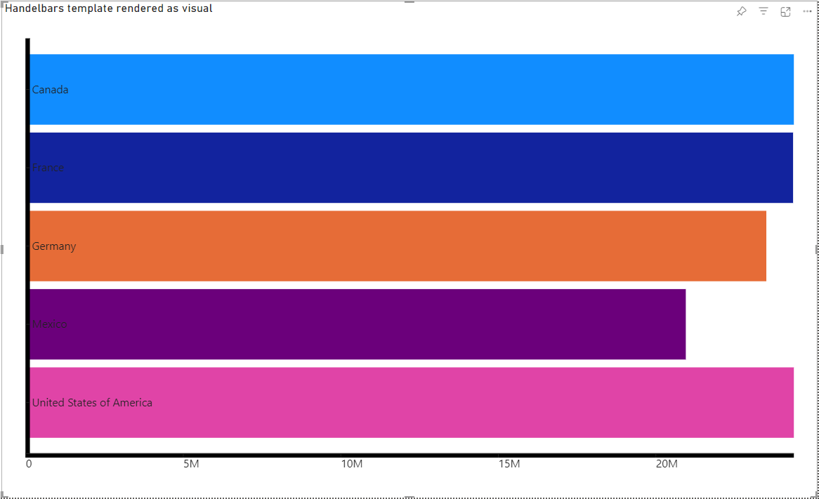
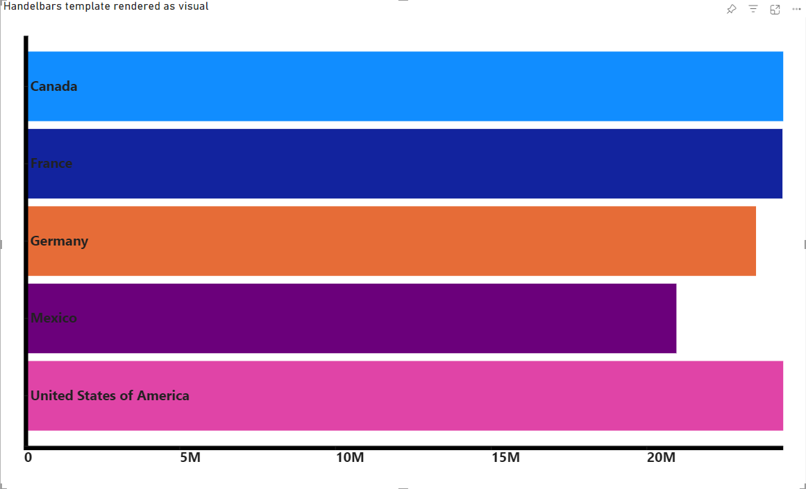
The final result:
The full template:
{{ var 'margin' 30}}
{{ var 'svgHeight' (sub viewport.height (val 'margin')) }}
{{ var 'chartHeight' (sub viewport.height 90) }}
{{ var 'svgWidth' (sub viewport.width 30) }}
{{ var 'rectHeight' (divide (val 'chartHeight') table.rows.length) }}
{{ var 'countries' (map 'Country' table.rows) }}
{{ var 'sales' (map ' Sales' table.rows) }}
{{ scaleLinear 'Scale X' (array 0 ( max (val 'sales'))) (array 0 (val 'svgWidth'))}}
{{ scaleBand 'Scale Y' (val 'countries') (array 0 (val 'chartHeight'))}}
{{ axisBottom 'axisMeasure' 'Scale X' }}
{{ axisRight 'axisCategory' 'Scale Y' }}
{{ setupScale 'Scale Y' 'paddingOuter' 0.2 }}
{{ setupScale 'Scale Y' 'paddingInner' 0.1 }}
{{ setupAxis 'axisMeasure' 'tickFormat' '~s' }}
{{ setupAxis 'axisMeasure' 'ticks' 5 }}
<svg width="{{ val 'svgWidth'}}" height="{{ val 'svgHeight' }}" {{{ useSelectionClear }}}>
    <g transform="translate({{ val 'margin'}}, {{ val 'margin'}})">
        <g>
            {{#each table.rows}}
            <rect
                {{{ useSelection @index}}}
                x="0"
                y="{{{ useScale 'Scale Y' this.Country }}}"
                width="{{{ useScale 'Scale X' this.[ Sales] }}}"
                height="{{{ getScale 'Scale Y' 'bandwidth' }}}"
                fill="{{{ useColor this.Country }}}">
            </rect>
            {{/each}}
        </g>
        <g transform="translate(0, {{ val 'chartHeight' }})">
            {{{ useAxis 'axisMeasure' 'Scale X' }}}
        </g>
        <g transform="translate(0, 0)">
            {{{ useAxis 'axisCategory' 'Scale Y' }}}
        </g>
    </g>
</svg>
<style>
    .tick text {
        font-size: 20px;
        font-weight: 700;
    }
    [data-selection="false"] {
        opacity: 0.5
    }
</style>