
5 posts tagged with "powerbi"

View All Tags

Charticulator Visual (View)

· 2 min read
Ilfat Galiev
Software Engineer

The first version of the visual for rendering Charticulator templates has been published in AppSource

AppSource search result for Charticulator word

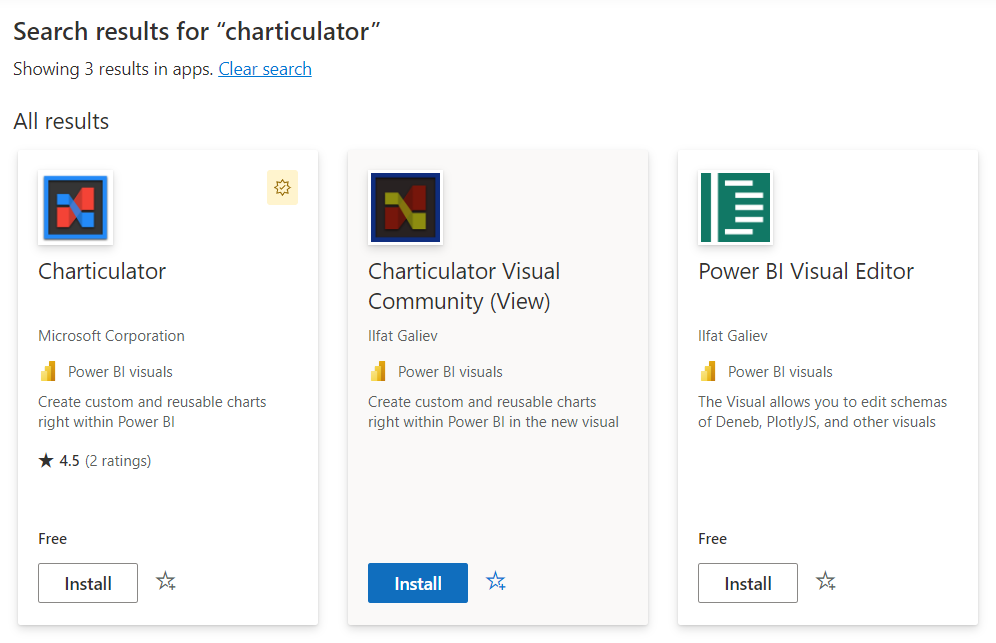
The editor version of the visual available on GitHub repository page or by direct link

Getting started

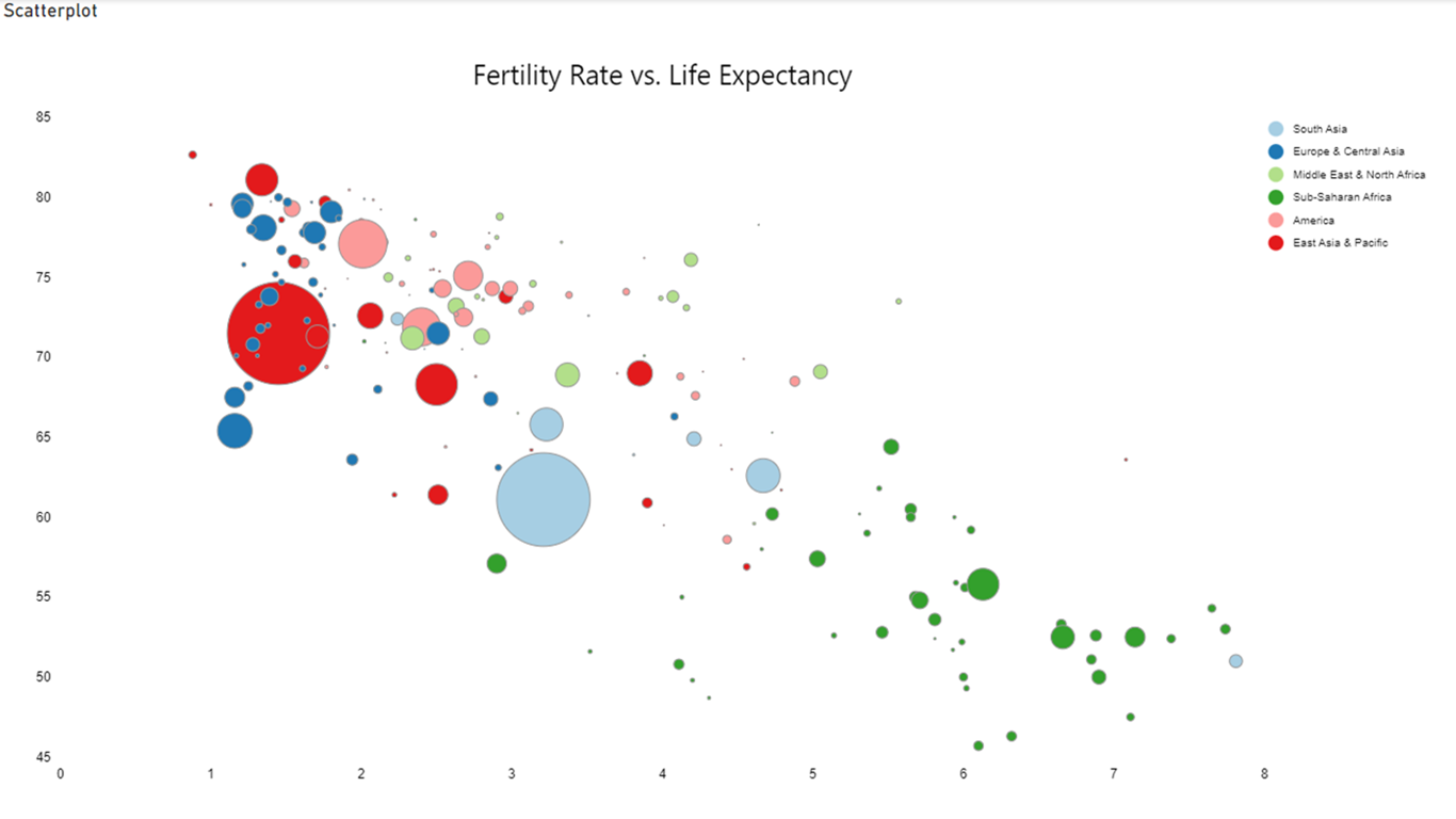
To use the visual, you need to create a new chart using either the old Charticulator or a visual with an editor, or import a template that you have (or took from https://charticulator.com/gallery/index.html).

You also can use The New Charticulator App to create chart templates.

The New Charticulator App

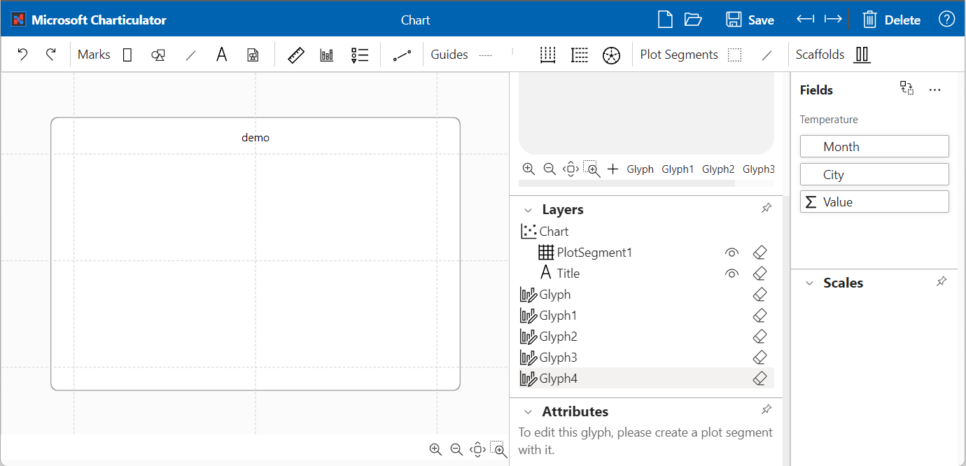
it's not recommend to use Old Charticulator App because it doesn't include new features and bug fixes.

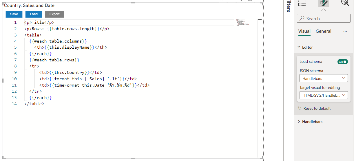
To import the template, create instance of the new visual, assign data from Power BI and switch the visual to edit mode by click on "Edit" on visual menu. You should see button to import the template, click on it and select template file. The visual saves the template in settings immediately.

Importing template

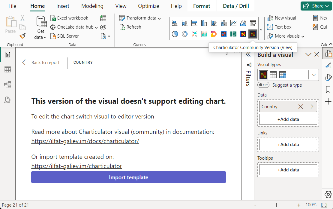
Click on "Back to report" to exit from edit mode.

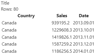
The visual shows the chart built from template if the visual has all data for template, otherwise it requires to provide columns mapping between data columns and template columns. In this case set column mappings and confirm by clicking on "Confirm".

Mapping Power BI columns to template columns

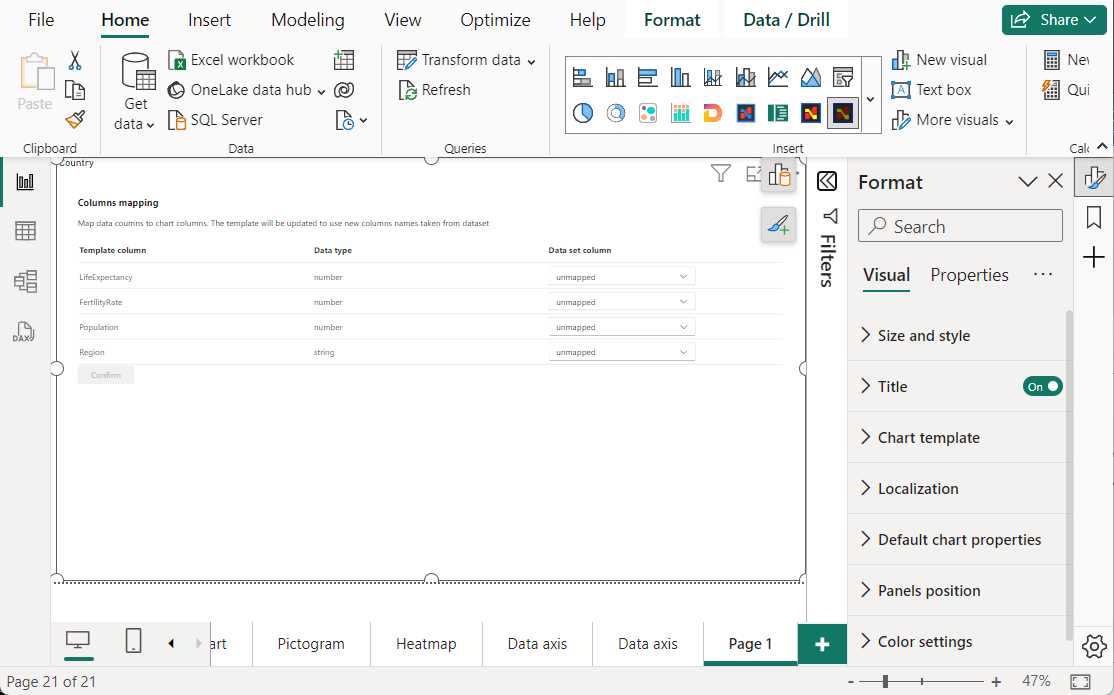
After that visual should show the chart built from template and data assigned from Power BI.

Visual sample

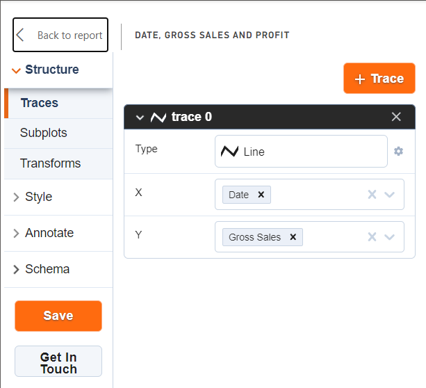
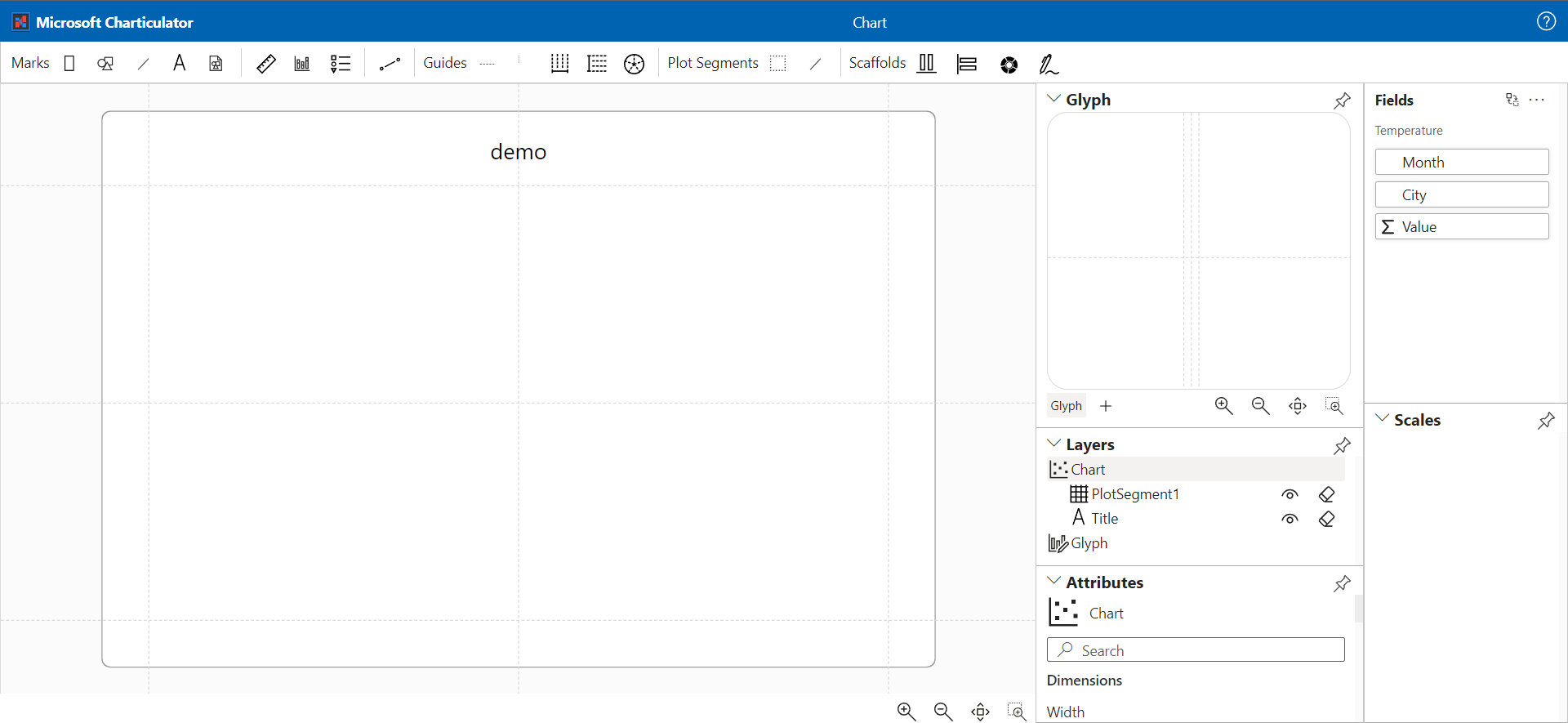
To build the chart from scratch, create instance of the visual and assign data, then switch the visual to old Charticulator visual or to the new Charticulator with editor.

After that click on "Edit" in visual menu to switch the visual to editor mode, it launches the Charticulator App for plotting new chart.

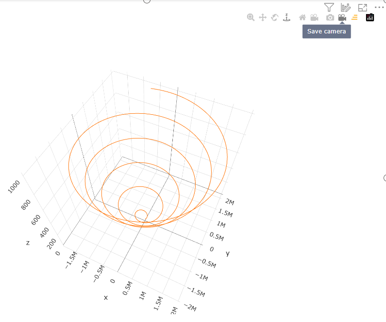
Save the chart and close editor by click on "Back to report", the editor version of the visual will show preview version of chart.

To save the chart switch back to the view version of the visual and save a report. The visual with editor will not work in Power BI services in view mode of the report.

Switching the visual to View version

Next steps

If you have an idea or suggestions, feel free to open a discussion on the GitHub repository page

HTML/SVG/Handlebars Visual

· 2 min read
Ilfat Galiev
Software Engineer

Here's a brief description of what I want to offer to the Power BI community. There may be a need for a visual that would allow the use of HTML and SVG to layout content in Power BI reports using data from Power BI. Yes, AppSource already has visuals that offer these solutions. But all of them load HTML content through data.

The video shows the process of using two visual objects to create a simple table.

The idea is very simple, I already have a visual that has the Monaco editor built in, with syntax highlighting and autocomplete. The second visual will display the handlebarsjs template, which is created using the editor. The templateizer allows you use handlebars expressions to use the data in the resulting output.

Example Handlebars expression

<p>{{there can be Power BI data}}</p>

gives us an HTML paragraph element with data from Power BI.

In the video, I use another example similar to the following one:

<p>Title</p>
<p>Rows: {{table.rows.length}}</p>
<table>
{{#each table.columns}}
<th>{{this.displayName}}</th>
{{/each}}
{{#each table.rows}}
<tr>
<td>{{this.Country}}</td>
<td>{{this.[ Sales]}}</td>
<td>{{this.Date}}</td>
</tr>
{{/each}}
</table>

The table object contains data in the form of a table passed from Power BI to visual.

I use the {{table.rows.length}} expression to get the number of rows. In the output, instead of {{{table.rows.length}}, the templating engine outputs the value. And it is dynamic, it updates the value when the data changes.

Handlebarsjs has custom helpers that allows developers provide custom functionality. I used it to provide D3.js formatting features.

You can use format and timeFormat functions to formad numbers and date.

<tr>
<td>{{this.Country}}</td>
<td>{{format this.[ Sales] '.1f'}}</td>
<td>{{timeFormat this.Date '%Y.%m.%d'}}</td>
</tr>

Output of template:

Template output with formatted numbers and dates

Try it for yourself:

Power BI Visual Editor

HTML/SVG/Handlebars Visual

HTML/SVG/Handlebars Visual is not 100% ready, there is no error output in the UI, to understand what is wrong you need to use browser DevTools if your template is not working.

Don't forget switch the target visual and schema for Power BI Visual Editor:

Editor settings

I'm currently experimenting with adding functions from D3.js, such as scale and axes.

Would love to hear your opinion, you can connect with me on LinkedIn

PlotlyJS Visual by Akvelon

· 3 min read
Ilfat Galiev
Software Engineer

Today the 1.7.3 update for PlotlyJS Visual by Akvelon has been approved by AppSource. Here I want to tell you about some small but important changes.

Internal refactoring the code of the visual

The first version was developed in a tight timeframe of 2 weeks. Since the idea was only to combine Chart Studio and Plotly.js visualization library, the internal code was very hard to read. The useState provided by the React library was used for state management, changes passed by Power BI to the update function were passed to the React component via forwardRef.

In version 1.7.3, the Redux Toolkit was added for state management, making the code much easier to understand and maintain.

Save button moved to left panel

The "Save" button has been moved to the left panel next to the "Get In Touch" button. Initially, after making changes through the visual editor, it was always necessary to go to the text editor to save the changes

PlotlyJS visual save button screenshot on the left panel

Button to save current position of camera

Added "Save Camera" button to copy current camera coordinates to JSON schema.

The &quot;Save camera&quot; button on the visual

This makes it faster and easier to set coordinates for the camera, and the camera does not return to the default position during the next visualization.

License error notification banner added

Added a descriptive notification banner with a link to a paid visualization feature.

You can remove the banner by turning off the paid functionality in the viewer's settings (Settings => Plotly.js properties => Power BI tooltips) or by purchasing a subscription on Microsoft Office 365 page.

License error notification banner

You buy Power BI's tooltip functionality, while the visualization itself is free.

You must purchase a license for each report user, regardless of role (report author or consumer).

There are only 2 subscription options at the moment:

  • Annual plan
  • Monthly plan

The paid feature is available to everyone in the following environments:

  • Embedded - Publish To Web, PaaS embed
  • National/Regional clouds (Depends on general support for transactability in national/regional clouds)
  • RS Server
  • Exporting (PDF\PPT) using REST API

If you still have questions, please contact Akvelon Inc. support.

Add loading segments by 30k rows instead loading all data per update

Visuals supports visualization of one thousand data points by default. But this can be changed by the developer in the settings to load thirty thousand data points.

But if even that isn't enough, Power BI provides a Fetch more data API for visuals that allows you to download more data (but no more than 100MB).

Power BI can provide data:

  • All at once, each time increasing the data portion by thirty thousand (30k, 60k, 90k e.t.c.).
  • By segments, shifting window of 30k data points

The first approach was already supported by this visual, starting with this version the second option is also supported

To use the new features, set the following settings:

Aggregaate segmetns settings

And add buttons to shift the segments into layout settings of JSON schema:

{
"layout": {
"updatemenus": [
{
"buttons": [
{
"args": [
{
"aggregateSegments": false
}
],
"label": "Previous",
"method": "loadPrevSegment",
"name": "loadPrevSegment"
},
{
"args": [
{
"aggregateSegments": false
}
],
"label": "Next",
"method": "loadNextSegment",
"name": "loadNextSegment"
}
],
"type": "buttons"
}
]
}
}

Example of a chart with buttons to shift segments:

Rendering 30k data points segments by segments

I hope these changes find applications in providing reports in Power BI for you and your clients.

Charticulator app deployment

· One min read
Ilfat Galiev
Software Engineer

Since the version of Charticulator from Microsoft is retiring, I decided to deploy to GitHub Pages the latest version with fixes and some new functionality. Unfortunately all this new stuff is not included in the Power BI Visual. In the next 2 months I plan to prepare alternative versions of visuals.

Charticulator app

The first stage is practically accomplished. In which I upgrade the UI library to Fluent UI 9. Since the first version doesn't work with React 18+ fully.

The upcoming work is fixing critical bugs in the current version of the visual, which block the implementation of the full cycle of chart development in the Power BI report.

Charticulator visual

· 2 min read
Ilfat Galiev
Software Engineer

It past a year after the first attemp to give breath Charticulator visual. I didn't get any feedback on the first version at the time, neither bad, good, or error message, but they were there.

Here's a second attempt. I will have the opportunity to publish a version on AppSource, I think it should help to find the old audience.

I forked the Charticulator source to my repository on GitHub, which is used internally by the new visual.

https://github.com/zbritva/charticulator

It already contains fixes and features that were not included in the original.

Editor is avialable for preview on https://ilfat-galiev.im/charticulator/.

And, yes, there is no httpS. Do not use for production

The source code for the new visual has been published on Github:

https://github.com/zBritva/charticulator-visual-community

The main difference from orginal Charticulator

The visual will be split into two parts. The first includes the Charticulator editor UI. The second includes only engine to render charts.

Report authors will have to use one visual to edit the chart and switch to the second visual before saving the report.

This approach allows:

  • significantly decrease the package size.
  • easier to obtain certification for the second, because less code for review.
  • Keeping the first (editorial) version uncertified opens your hands for more technical possibilities, (downloading from the gallery or moving part of the editor code to CDN and so on).

Community

Fell free to open any discussion on GitHub, even it is about closing.

The road map is stabilization and close workflow of the visual. Then submitting the first versions to AppSource.