PlotlyJS Visual by Akvelon
Today the 1.7.3 update for PlotlyJS Visual by Akvelon has been approved by AppSource. Here I want to tell you about some small but important changes.
Internal refactoring the code of the visual
The first version was developed in a tight timeframe of 2 weeks. Since the idea was only to combine Chart Studio and Plotly.js visualization library, the internal code was very hard to read. The useState provided by the React library was used for state management, changes passed by Power BI to the update function were passed to the React component via forwardRef.
In version 1.7.3, the Redux Toolkit was added for state management, making the code much easier to understand and maintain.
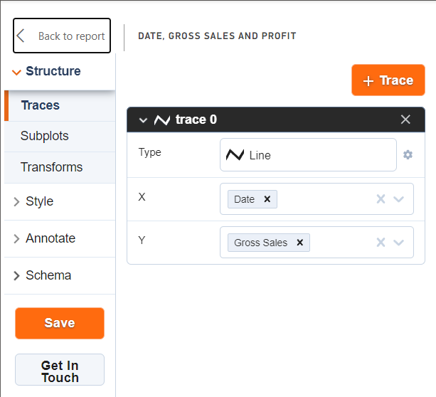
Save button moved to left panel
The "Save" button has been moved to the left panel next to the "Get In Touch" button. Initially, after making changes through the visual editor, it was always necessary to go to the text editor to save the changes

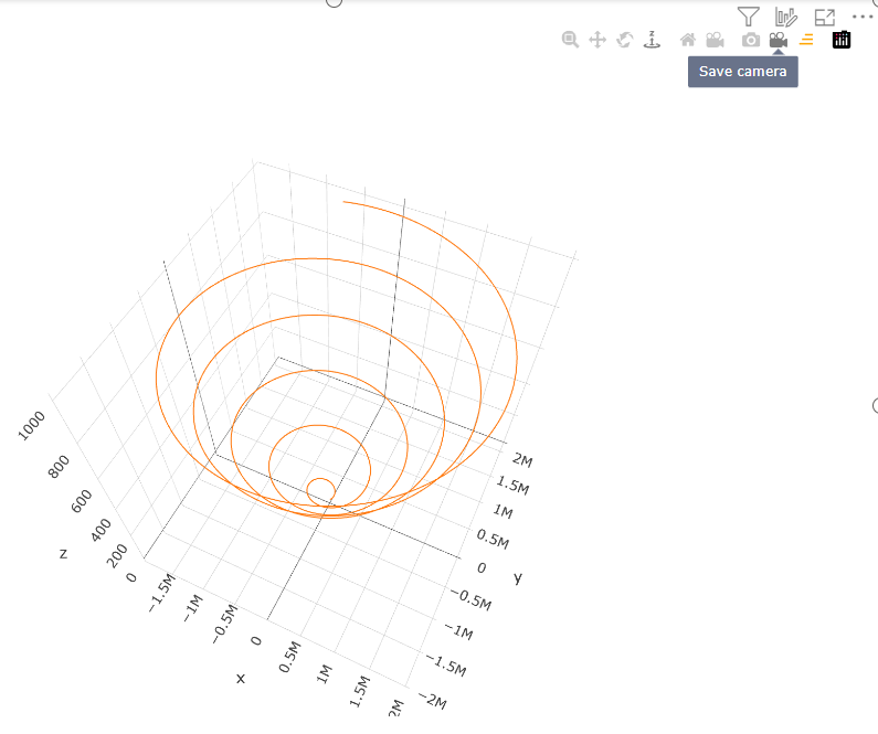
Button to save current position of camera
Added "Save Camera" button to copy current camera coordinates to JSON schema.

This makes it faster and easier to set coordinates for the camera, and the camera does not return to the default position during the next visualization.
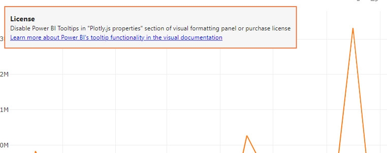
License error notification banner added
Added a descriptive notification banner with a link to a paid visualization feature.
You can remove the banner by turning off the paid functionality in the viewer's settings (Settings => Plotly.js properties => Power BI tooltips) or by purchasing a subscription on Microsoft Office 365 page.

You buy Power BI's tooltip functionality, while the visualization itself is free.
You must purchase a license for each report user, regardless of role (report author or consumer).
There are only 2 subscription options at the moment:
- Annual plan
- Monthly plan
The paid feature is available to everyone in the following environments:
- Embedded - Publish To Web, PaaS embed
- National/Regional clouds (Depends on general support for transactability in national/regional clouds)
- RS Server
- Exporting (PDF\PPT) using REST API
If you still have questions, please contact Akvelon Inc. support.
Add loading segments by 30k rows instead loading all data per update
Visuals supports visualization of one thousand data points by default. But this can be changed by the developer in the settings to load thirty thousand data points.
But if even that isn't enough, Power BI provides a Fetch more data API for visuals that allows you to download more data (but no more than 100MB).
Power BI can provide data:
- All at once, each time increasing the data portion by thirty thousand (30k, 60k, 90k e.t.c.).
- By segments, shifting window of 30k data points
The first approach was already supported by this visual, starting with this version the second option is also supported
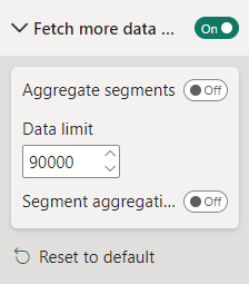
To use the new features, set the following settings:

And add buttons to shift the segments into layout settings of JSON schema:
{
  "layout": {
    "updatemenus": [
      {
        "buttons": [
          {
            "args": [
              {
                "aggregateSegments": false
              }
            ],
            "label": "Previous",
            "method": "loadPrevSegment",
            "name": "loadPrevSegment"
          },
          {
            "args": [
              {
                "aggregateSegments": false
              }
            ],
            "label": "Next",
            "method": "loadNextSegment",
            "name": "loadNextSegment"
          }
        ],
        "type": "buttons"
      }
    ]
  }
}
Example of a chart with buttons to shift segments:

I hope these changes find applications in providing reports in Power BI for you and your clients.